Support
Newsletter Signup
Sign up for our newsletter to stay up to date.
Don't worry. We only use your email to send you relevant news. No spam. Promise.
 POWERFUL PROTOTYPING
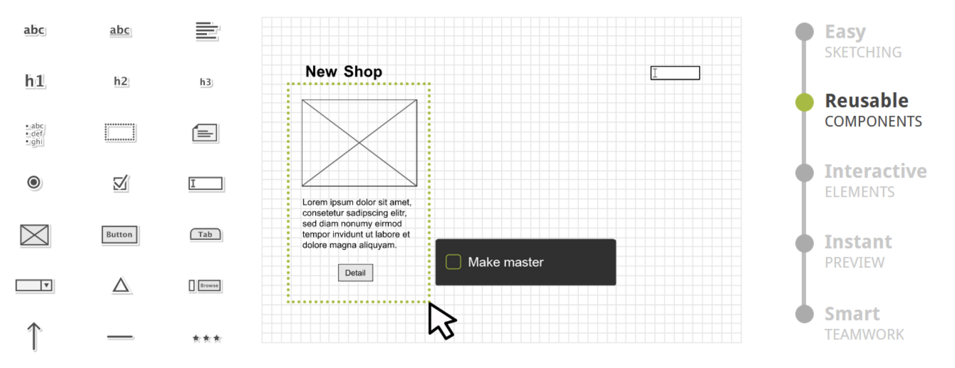
Berlin, Februar 2024 – Das Team von Pidoco verstärkt zukünftig die Digital Consultancy Forte Digital Central Europe. Pidoco bringt über 15 Jahre Erfahrung in der Entwicklung komplexer Webanwendungen mit höchsten Ansprüchen an User Experience in das internationale Unternehmen mit ein.
Die Expert*innen für digitale Produktumsetzung ermöglichen Forte Digital eine noch bessere Integration von Data Science, Künstlicher Intelligenz und Content Commerce in ihren Serviceleistungen unter Führung von Co-Founder und CTO Tino Truppel; Tino Truppel wird künftig als Technical Director die Technologieabteilung in Berlin leiten und dabei als Bindeglied zwischen dem deutschen und den internationalen Teams fungieren.
Die neuen Berater werden dafür sorgen, das Wachstum strukturiert bedienen zu können. „Wir freuen uns, im hart umkämpften Markt für Digital-Experten immer wieder Top-Personal zu gewinnen“, sagt Joachim Bader, Managing Partner von Forte Digital Central Europe.
Die Digital Consultancy Forte Digital Central Europe mit Sitz in Berlin ist seit knapp zwei Jahren im deutschen Markt aktiv. In dieser Zeit konnte das Team um Joachim Bader und Christof Zahneissen, ebenfalls Managing Partner von Forte Digital Central Europe, namhafte Unternehmen gewinnen. Neu auf der Kundenliste stehen Berlin Health Media, die Charité, DAK-Gesundheit, DefShop, MPREIS, Mrs. Sporty, Pixelwerker und Softgarden. Nun gilt es, das Neugeschäft in den Branchen Retail, Digital Health, Manufacturing und Publishing auszubauen.
Die beiden Pidoco Co-Founder Philipp Huy und Silvan Golega konzentrieren sich auf Ihre Rolle als Geschäftsführer von Büro am Draht.

Sign up for our newsletter to stay up to date.
Don't worry. We only use your email to send you relevant news. No spam. Promise.